Three Ways to Level-Up your “Point and Shoot” Photography in Africa
If I’ve said it once, I’ll say it again—Africa is the holy grail of wildlife photography destinations and is so regardless of whether you have a big fancy camera, or an introductory point and shoot. The photos you’ll come away with are nothing short of mesmerizing.
However, through a few simple compositional techniques you can elevate your photography on your next African nature safari. While this article is designed for those with point and shoot cameras, the lessons here apply to anyone that appreciates the importance of creative and powerful composition in nature photography.
You should Obsess about Composition
The reason I chose to use the word obsess it because composition is going to become your superpower when on a point and shoot camera. Sure, point and shoot cameras can still be customized with aperture, shutter speed, etc. However, I also know most folks in the point and shoot world prefer “full-auto” settings. And more power to ya! This just means that there are things you can’t change, like the exposure, nor depth of field. Thus, those things you do have in your control are your sole focus.
Composition is exactly that and just happens to be one of the most important elements of photography no matter what camera you’re on.
Within the world of composition, we must start with the rule-of-thirds. And yes, it’s because it’s that good!
Rule of Thirds
There are many ways to interpret the rule of thirds and fortunately—they’re all correct!
The most basic way of interpreting it comes down to the division of your scene into thirds—both left to right and top to bottom.

Instead of placing prominent lines or features like landscapes or trees in the middle, try offsetting them slightly so they’re at one of the third-lines. The eye (and the brain) prefer seeing scenes split this way versus being perfectly bisected in halves.
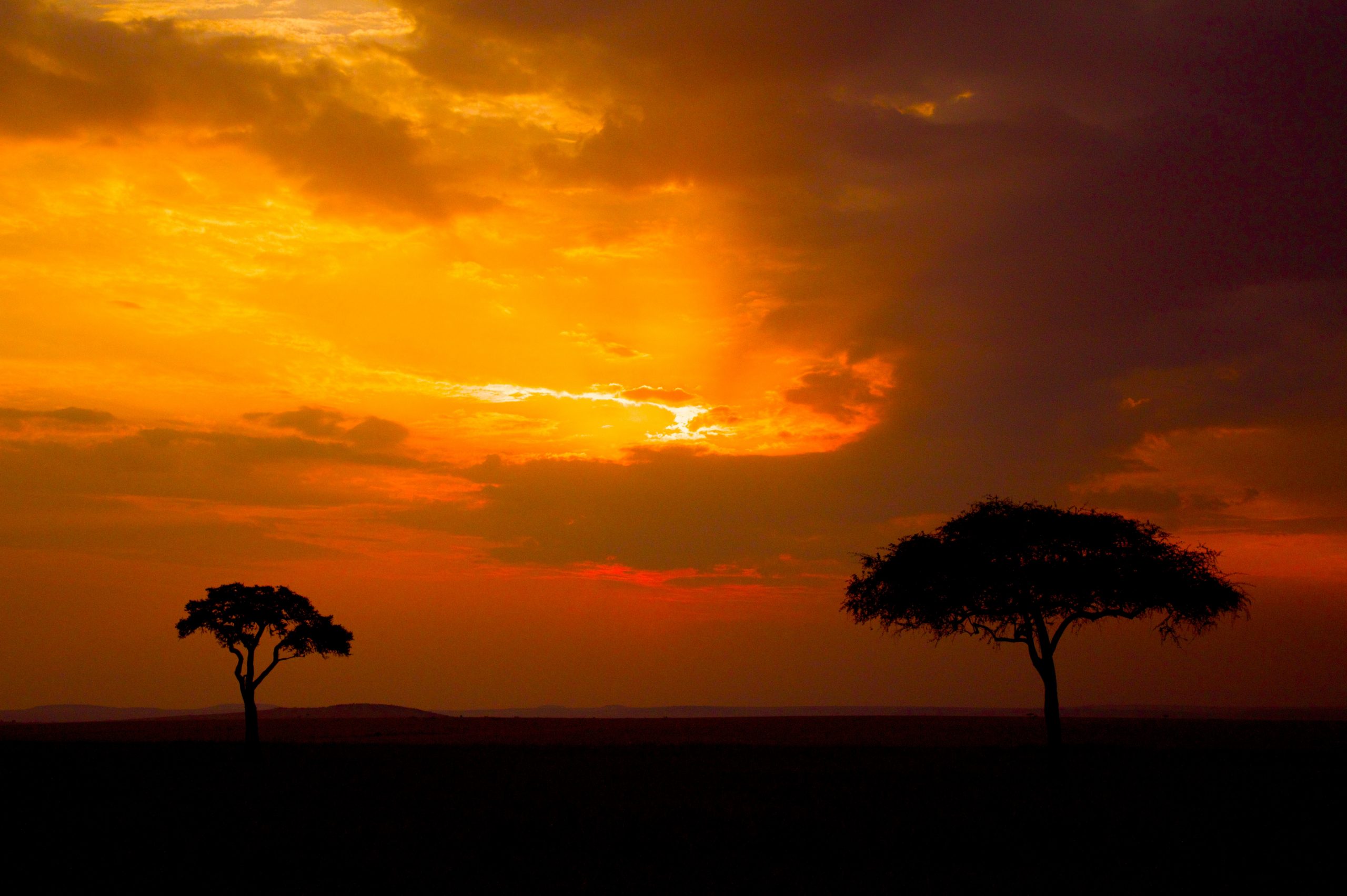
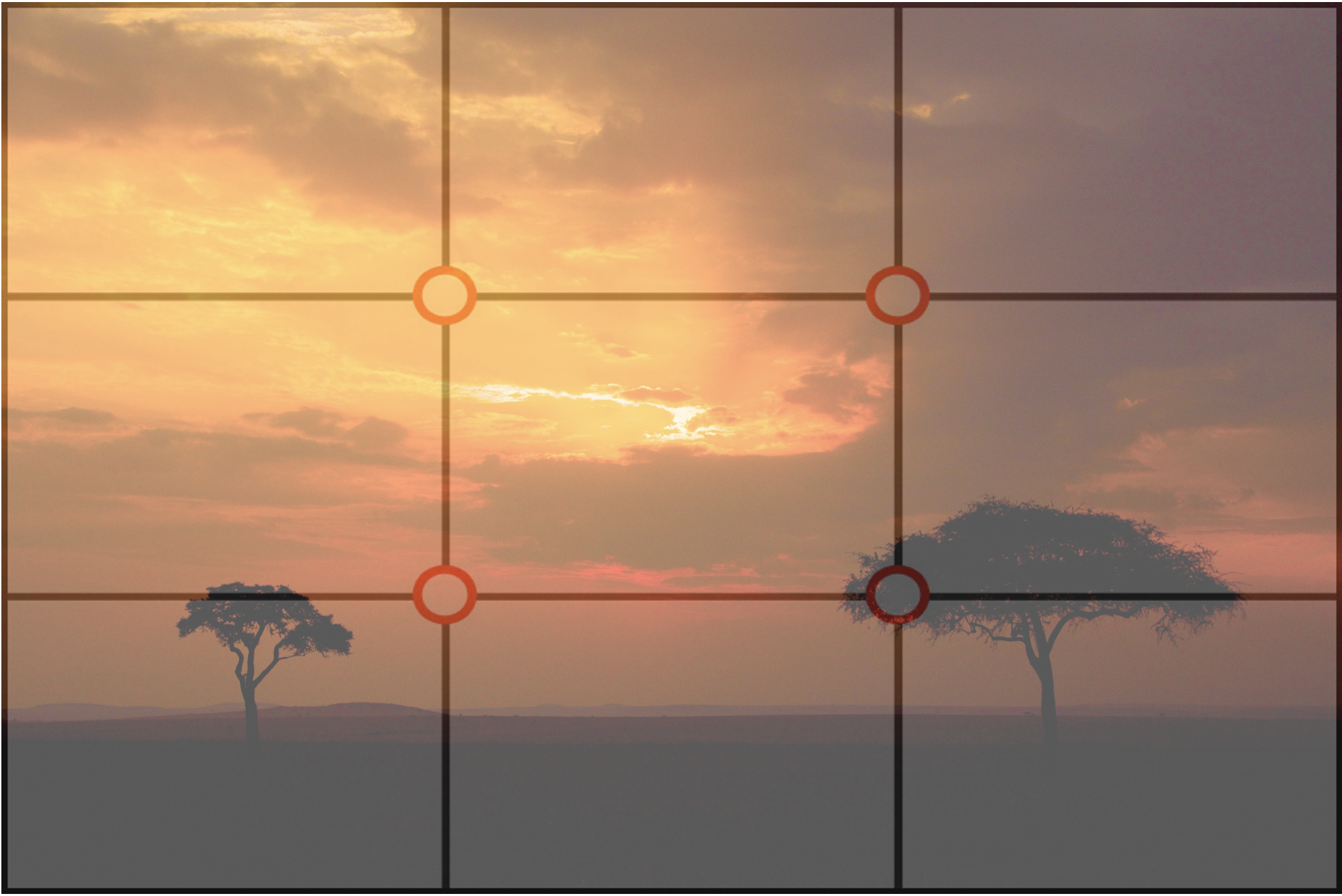
See how the land itself is placed almost entirely in the bottom third? This leaves the sky to take up two thirds. This one third to two thirds division is a great way to compost landscape photography like sunrises and sunsets.
The more advanced way of looking at the rule of thirds is by placing prominent features rather precisely at the intersecting points of the four lines. In other words, pick one of the four intersections and use that as the position of your subject—the animal, flower, sunset, etc.
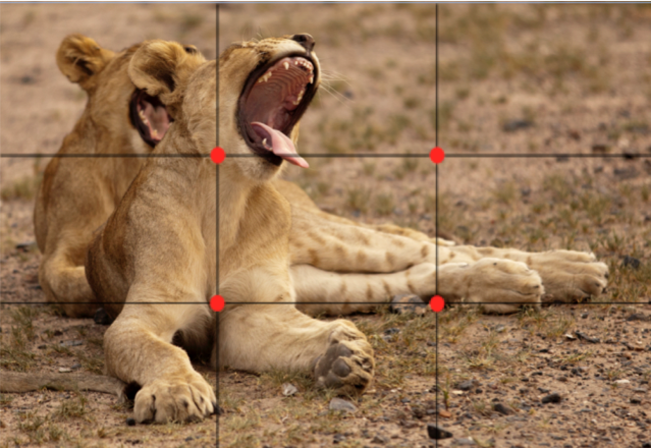
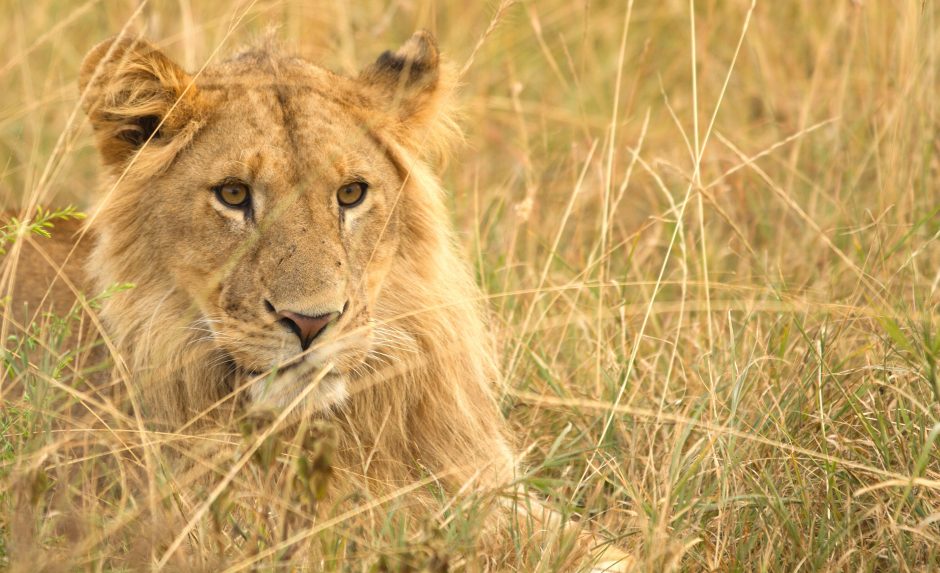
See how the lion cub’s head is at the upper left intersecting point? That’s the idea. And frankly, it could be even more precise by placing its wide-open mouth on that point, as that is really what the photo is focused on.
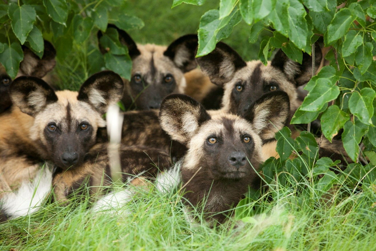
Some other ways to use this rule are to leave open space in the scene based on this concept of thirds versus halves. That is, if you have a lion looking across the savanna, position that animal such that it’s right over one of the vertical lines, with perhaps its head or eye smack dab over the intersecting point, looking toward the open space of the frame. When an animal is looking left or right, aim to keep at least one third of the scene open in the direction it’s looking.

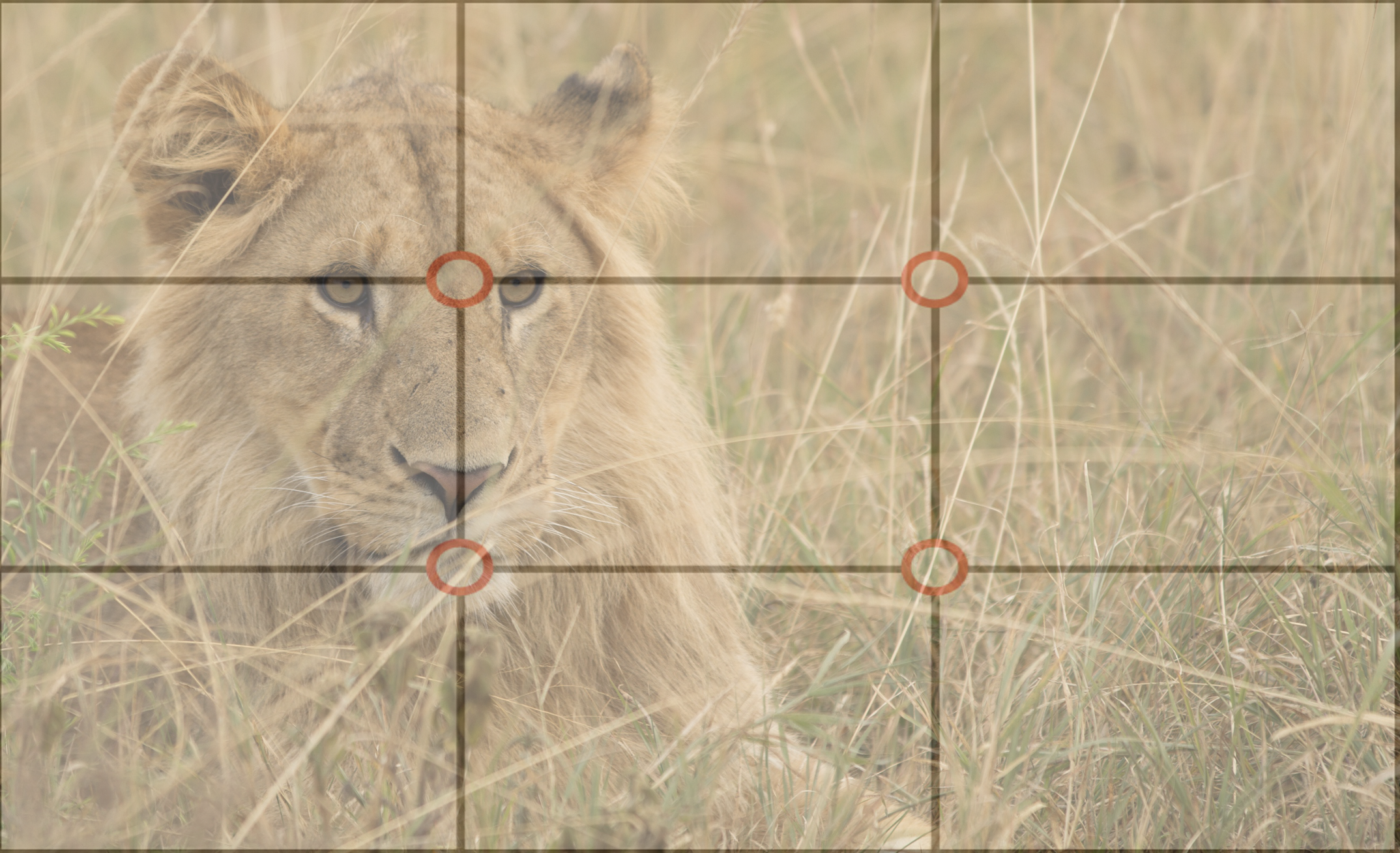
See how in the above photo the lion is perfectly positioned over the left two intersecting points and facing in the direction of the open third? This is very intentional and makes for great composition.
As you can see, there is a lot left to interpretation from this “rule.” The key thing is that you do interpret it in some way—any way—as all considerations will level-up your photo.
If you can combine several of the ways to interpret this rule in one photo, like in the lion example, that just makes the photo that much more visually appealing to the viewer.
Leading Lines
Another key compositional technique also involves lines, but in less of a “grid” fashion. With leading lines, you simply are using lines in your landscape to help create an evocative composition.
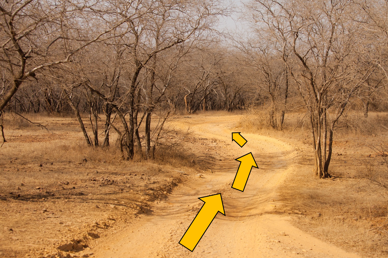
Traditionally (at least for me) I use leading lines to point to my subject or take the viewer on a “journey”, such that the viewer innately follows the leading line. When leading to a specific subject (not entirely necessary) it makes the subject that much more prominent and impactful to the viewer. For landscapes like in the above photo, it helps show depth and complexity in the scene.
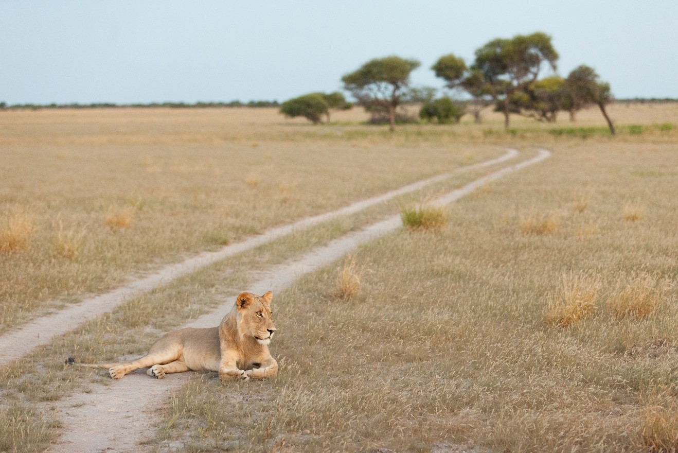
In the above photo, the game path helps draw the eye to the subject. While in this case the subject is already quite prominent, the line helps evoke a sense of pathway, leading toward the trees in the distance, drawing in a landscape element of the scene.
However, leading lines can also come in the form of framing, which can evoke a really great feeling of discovery or exploration, which is a wonderful way to showcase nature adventures and wild places.
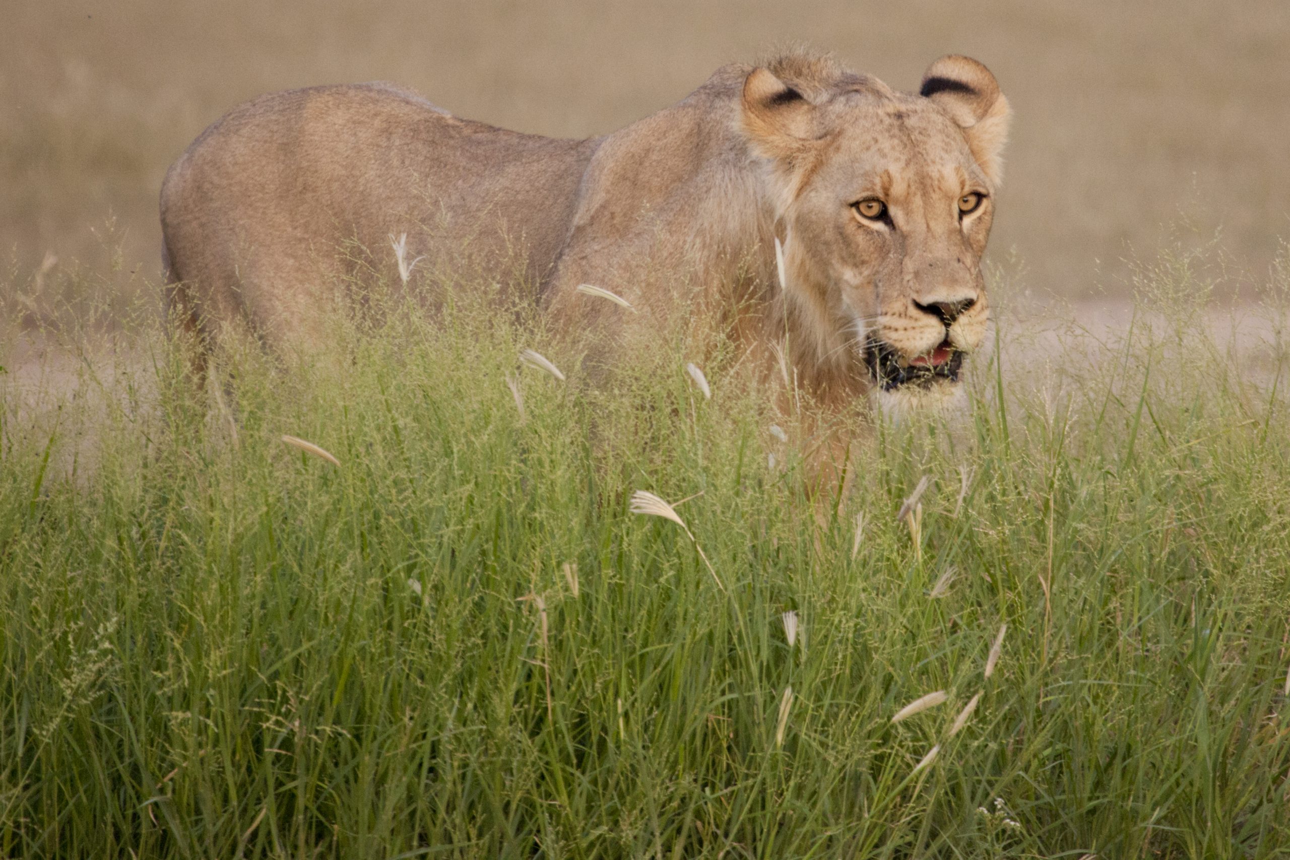
In the above photo, the grass acts like a framing line, pushing the viewer’s eyes up out of the grass toward the lioness. She is emerging from the grass, giving this photo a sense of discovery or unveiling, which adds more emotion and intrigue than just a lioness without the grass.
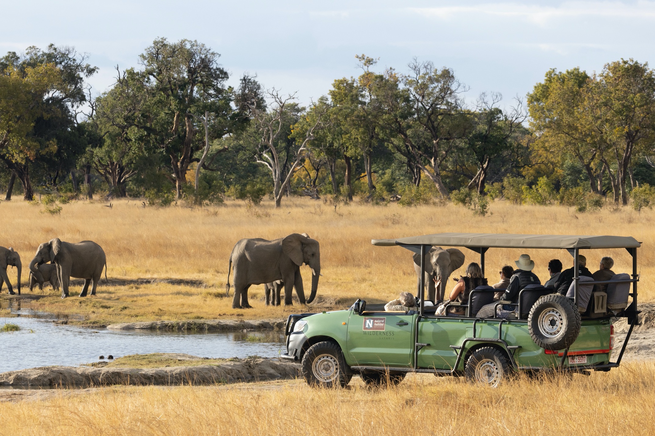
In the above photo, the vehicle actually acts as a leading line of sorts. The direction it’s facing acts like a line, pushing the viewer’s eyes toward the elephants.
Exaggerated Composition
One thing I love about rules is that you can break them. No, I’m not a natural born renegade, but I do think there are some great examples of how breaking the classic rules of composition, like the rule of thirds, is worthwhile and even celebrated.
One particular method I use is exaggerating the composition of the frame. In other words, rather than placing your subject at one of the classic intersecting points according to the rule of thirds, I place the subject deliberately in a very extreme edge or even corner of the shot.
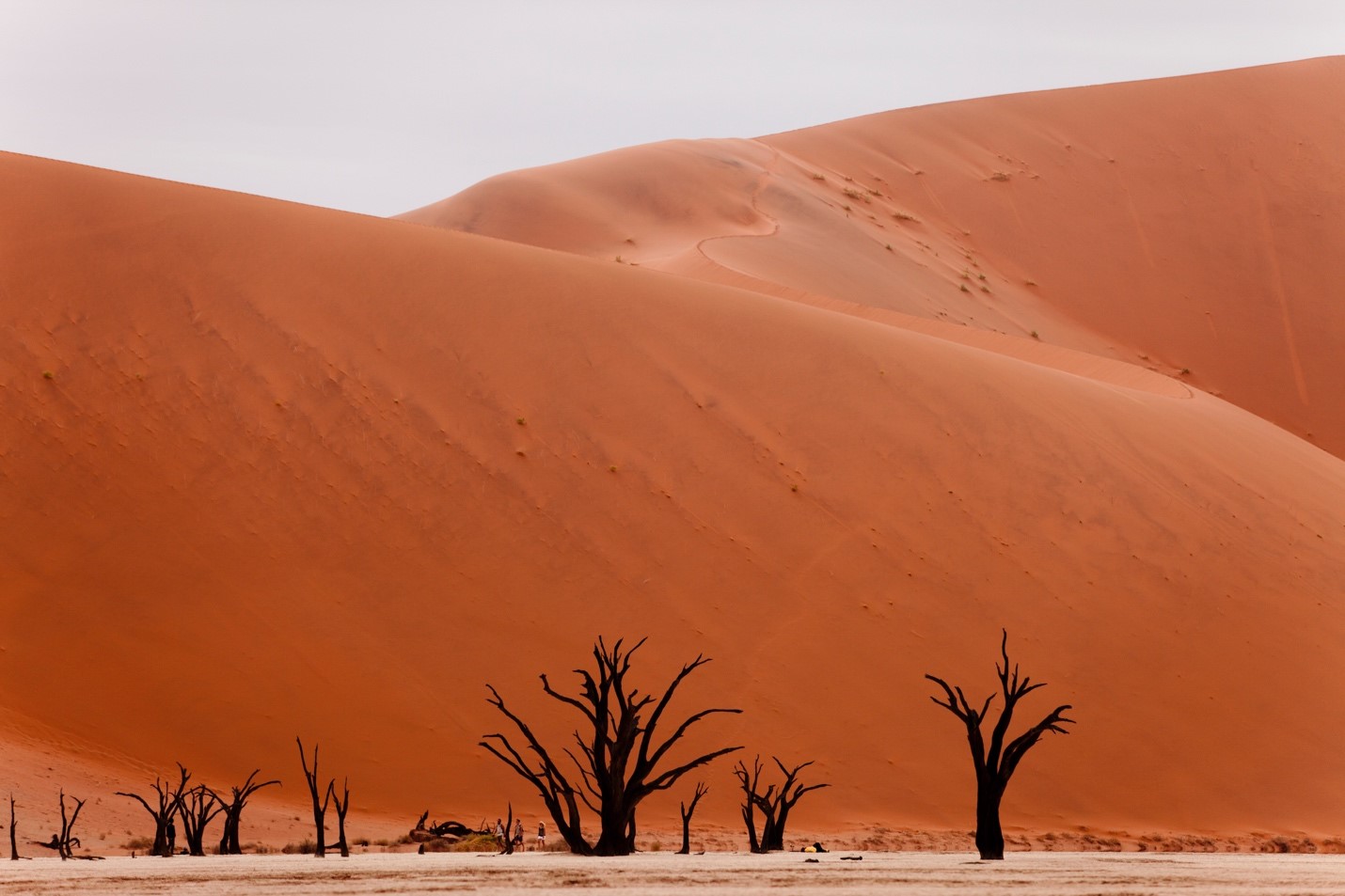
See how I’m breaking the rules by placing the trees, and ground, at the very bottom sliver of the scene?
But doesn’t this diminish the subject? Yep, you’re darn right it does!
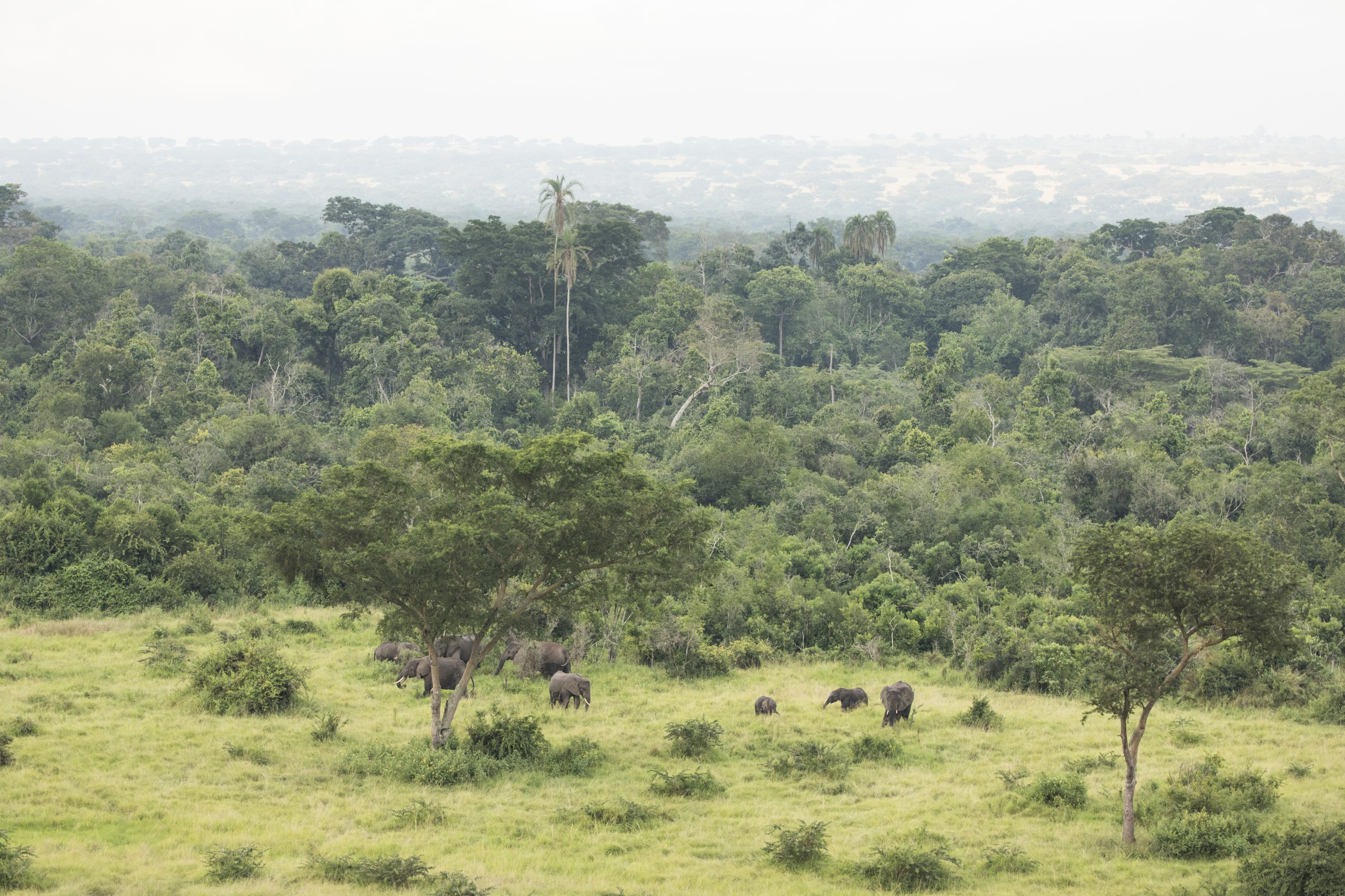
So, in this case, you are deliberately trying to diminish the subject at the benefit of the landscape. For example, if you come across a mighty animal in a mighty landscape, which is oh-so-common in Africa, you can actually bolster the power of the landscape by diminishing an otherwise rather impressive animal. In other words, because the animal is framed to make it look relatively small and insignificant, the rest of the landscape looks extremely impressive.
There are many, many other techniques one can learn about harnessing the power of composition, and for those eager to go beyond my own articles on composition. I highly recommend a great book by Michael Freeman called The Photographer’s Eye. It’s an illustrative guide to so many ways to look at composition and was instrumental for me in my early days of self-taught photography.
Hopefully this is proof that composition is so powerful and important in all photography. One of the things I really like about point and shoot cameras (or just shooting on full-auto on any camera) is that it really forces you to concentrate on composition as a major pillar of photography because you aren’t worrying about aperture, white balance, etc.
As always, practice makes perfect and there is no better way to get out there and practice than being on a proper photo adventure in some far flung corner of the world!
Enjoy it out there!
Court
Leave a reply