
Why you should “choose” your background
When your photograph features some sort of subject (we are partial to wildlife, of course!) you can instantly improve the photo by making sure you are cognizant of your background options. While not all wildlife or people photography will allow you so much flexibility, once you become aware of this trick, it becomes more commonplace than you’d think.
So here’s the scenario…
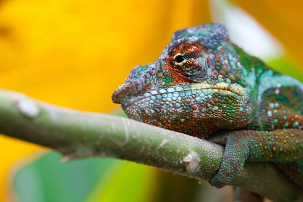
You’re out photographing in the wilds of Madagascar and you encounter a spectacularly colored chameleon. In the below example, we’ve got the venerable panther chameleon. This animal is not skittish, it’s perched more or less at eye level. And it’s surrounded by foliage. You want the shot. You probably already have in mind some camera settings, and how you wish to compose the photo. However, are you paying attention to the colors, textures, and anything else in the background of the photo? Or are you just primarily concerned with the chameleon, the composition, the depth of field, and that sort of stuff.
As you can see below, I took note of the colors and textures around me and I positioned myself such that some nice yellow foliage was in the background. This wasn’t absolutely necessary to get a neat shot, but it elevated it from being a decent photo of a colorful animal into one that is popping. It stands out.
With wildlife photography, planning this type of shot certainly isn’t always possible. In fact, it’s probably impossible 6 times out of 10. However, for those other moments when you can pivot, or perhaps move a little down the trail or up a hill, it’s key that you’re aware of this opportunity.
This is the time to get artsy
What do you want the dominant color scheme to be? Do you want the background to purposefully clash with the animal in order to create a bit of contrast or tension in the scene? Or do you want to showcase the unique pattern or cryptic coloration of the animal in its environment by matching the colors. Sometimes just a few steps in either direction can make a huge difference.
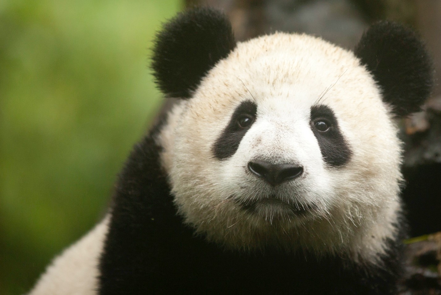
Notice how in the above photo there is a rather dark tree trunk just behind and to the right of the panda. And to the left, there is a nice green color. Depending on what I want in the background, I could have pivoted slightly to the left to get that brown/gray trunk more dominant in the scene. However, I did the opposite and moved to my right to showcase that nice, soft green as my background color. It makes a difference.
As with most things, practice makes perfect. There is no perfect formula for how to choose the background and you must ultimately work with what you’ve got.
The key takeaway here…
…is that the background matters, even when it is blurred in classic wildlife portraiture photography. Rather than just treat it as non-essential to the scene and snap at first opportunity, take a moment to look at the surroundings and see if you can be deliberate in where you are in relation to the animal and “choose” your background.
Cheers, and be well!

Court
Leave a reply