Winner of our “Filling the Frame” Challenge
Once again, a stunning array of inspiring photos to match our “Filling the Frame” photo challenge! From full-frame elephant photos, to underwater masterpieces, and even an echidna with its alluring spiny texture! It was difficult to pick a sole winner. However, one did stand out as a really captivating example of filling the frame, and that came in from Sabrina Smart out of Sydney, Australia, with her Contradiction photo below.
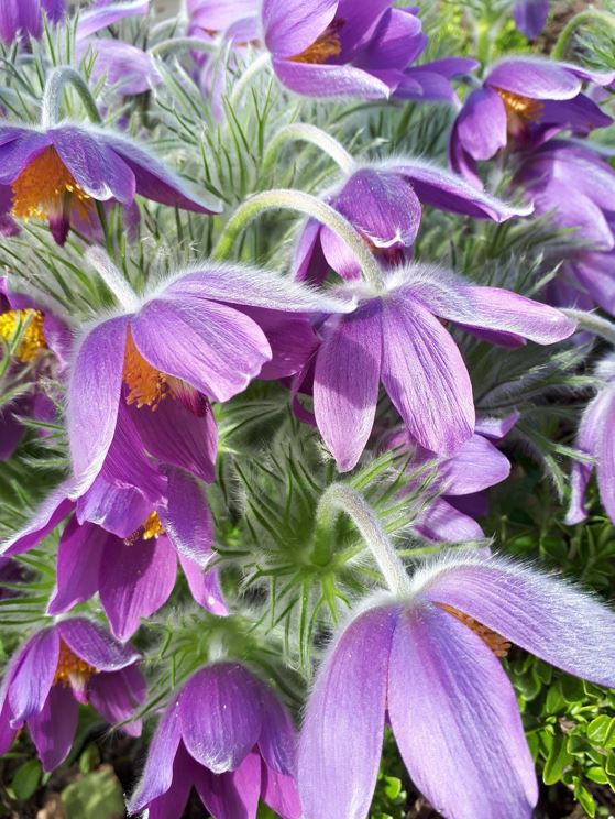
The first thing that stood out to me was the intriguing fill-the-frame pattern of this photo. And while most of the time I’m looking at a single subject to fill the frame, I thought this was wildly clever to use a pattern to fill the frame. In this case, we have an example of filling the frame with multiple subjects of similar color, pattern, texture, and orientation. Because each of the subjects is so similar to the other, it lends itself really well to this style and technique. Bravo!
Then, upon looking closer, I really marveled at the composition of this photo. Maybe you did the same when you first looked at the above shot…I thought there really is something about this that is captivating. And often, at first, you don’t know why. Usually this is because of immaculate composition. So, what I do in these cases when I can’t quite put my finger on it, is to overlay a couple different compositional tools to see what’s going on.
The first is a classic “rule of thirds” grid, which I have below.
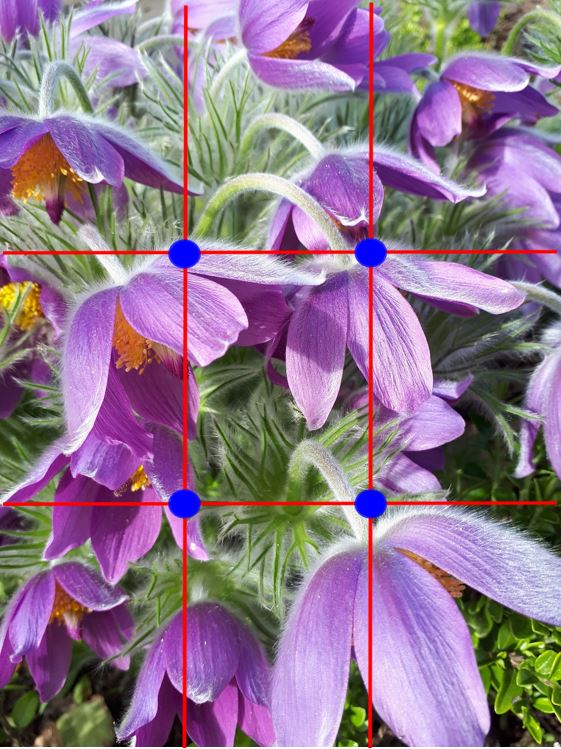
As you’ll see from this overlay, there’s not anything all that notable about the significance of the rule of thirds and how it applies to this photo. Nothing’s wrong, but nothing is remarkably spot on…right? But, take a look when you overlay the other key compositional tool—the golden ratio, or Fibonacci spiral.
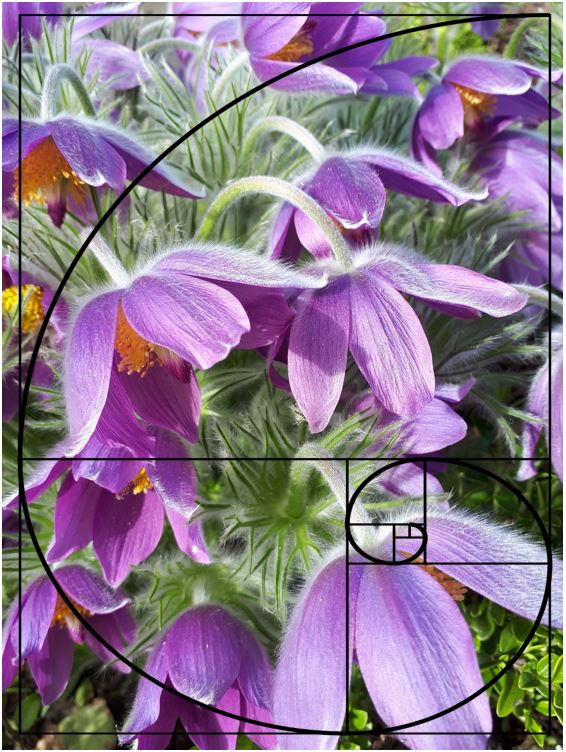
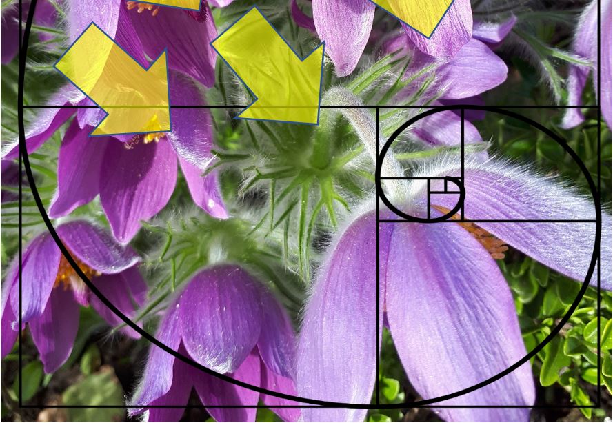
WOW! Uncanny how much of a perfect match this is, right!? Notice how the upper part of the spiral scoops the main subjects into the feature of the frame, and that concentric circle focuses SPOT ON one of the most prominent flowers in the frame.
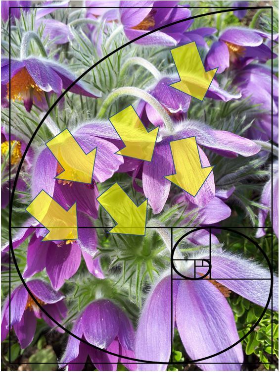
And there’s another brilliant compositional element to this photo, which are the leading lines generated by the flowers, their petals, and their stems. Notice how they’re all directing your eye down to that biggest flower, and the focal point of the photo?
So, as you can see, I’m a big fan of this photo, and for some unique reasons that I’ve stated above, But to summarize, first, I love that it’s a little outside the box, in that it’s the color, pattern, and “likeness” that really fills the frame—not necessarily a single subject. Second, the composition is just wonderful. Remember, when taking photos, you always have the option of cropping in a little, so you can always aim to nail the perfect composition as you take the photo, but also pay special attention to how you can crop when you’re editing in photoshop, iphoto, lightroom, etc. And finally, the color, lighting, saturation, and general exposure is spot on. Dominant color, beautiful areas of subtle light and dark, and generally even lighting.
Once again, great job, Sabrina! And great job to all others that submitted as there were some stunningly creative compositions and ideas in those, too. I look forward to announcing the next challenge shortly! In the meantime, if you have a topic or question related to “filling the frame”, be sure to leave a comment below and we’ll get to it.
All the best,
Court