Composition Corner: An Alluring Village Scene
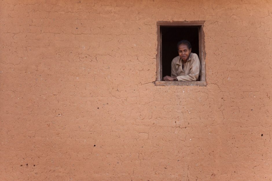
Cities and villages encountered while traveling can be a great opportunity to practice composition, for lines and other elements are often quite different than those found in nature. For instance, in the above photo (photographed in a remote village in Madagascar) there is a large uniform texture and color interrupted perfectly by a symmetrical shape – a window. Thus, you can really be deliberate in how you frame elements and ultimately compose your shot.
The photo is wonderfully austere and really captured an intriguing scene of a local Malagasy woman looking on the village below. However, because the scene is so plain, composition is at the forefront, and one of the primary things the viewer notices.

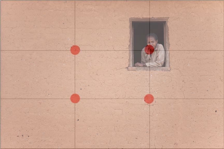
As you can see, the window with the Malagasy woman is right at the upper right intersection of the grid lines. Would this still be an interesting photo if the window were right in the middle of the shot? Yes, sure, the story would be similar, but being offset makes it more dramatic and evocative – exactly what we’re looking for when it comes to travel photography.
It is no coincidence that this window was placed squarely over this “rule of thirds” intersection, and the shot was set up that way from the start. So, we know that the intersecting points have major significance when placing prominent objects (and in this case the ONLY object in the shot). However, what if we were to place it in one of the other intersections?
Well, we could have placed the woman in the window on one of the lower intersections, but this would give the photo quite a different feeling. When actually taking the photo, this window was perched high on the second story of the building. Thus, by positioning it high in the frame it evokes that feeling of being high up – just as it was when it was photographed.
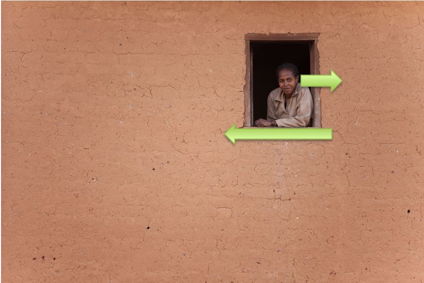
But what about putting it on the upper left intersection? That’s a tough one. On one hand, the woman is looking right, and as I often mention it’s important to allow space in the direction that the person (or wildlife with nature photography) is facing. However, in this case there is a strong line being made by the woman’s arm, facing left. Normally this would not be a strong leading line, but since the woman in the window is the main subject in the photo, this arm becomes quite influential in the overall composition of the photo. What seem like small attributes in the overall space of the photo are “magnified” due to the simplicity of the photo.

As with most rules in photography, including those with composition, rules are meant to be broken. This photo could still be compelling (and maybe even more so?) had it been composed differently. However, they key thing is that you ought to be able to justify why you chose to do what you did with the photo. You should subconsciously ask yourself with each photo taken. While some creative photos seem to be haphazardly artistic, it couldn’t be more the opposite. To me, the highest quality art and photography come from those that are deliberate and precise, yet are able to subdue the complexity underneath a simply beautiful creation.
Go forth and give it a shot,
Leave a reply