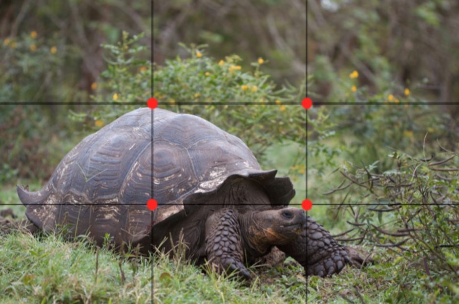
Composition
Composition in photography is arguably one of the most important considerations before, during, and after taking the shot. It’s a topic significant enough to warrant entire books (and such books do indeed exist!). However, one of the greatest things about photographic composition is that through only a few simple guidelines and bits of advice, your photography has the potential to improve significantly. After employing a few basic tricks, you may not even be able to explain why your photographs are markedly better, but it is nevertheless incredibly evident and personally rewarding.
One of the first things to consider when taking photos is that rules are meant to be broken. Never take these guidelines as non-negotiable directions. That being said, however, there are some simple rules that you should consider for most of your photography, especially if you’ve never tried them before. Then, if you decide to ignore basic composition rules, you’ll at least know that you’re breaking them!
The first and greatest rule for composition is what’s known as “the rule of thirds”. It is remarkably simple and general at the same time. The rule basically begins with overlaying an imaginary (or actual) grid over your viewfinder. Actual in the sense that some cameras allow you to push a button to digitally overlay a grid on your screen.
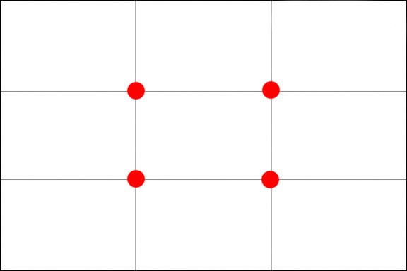
http://www.photoble.com/wp-content/uploads/2010/06/Rule-of-Thirds-grid-with-dots.jpg
The idea is that photos will look more pleasing if you employ a sense of “division” within the photo, such that the grid becomes meaningful. “Meaningful” is a very general statement, and it’s supposed to be. The grid could lead you in a variety of ways, based on intersecting points or dividing the photo along horizontal or vertical rows.
The best way of explaining this is via examples. In this one below, a pleasing photo of a night scene in Antarctica…
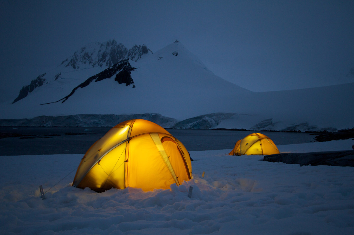
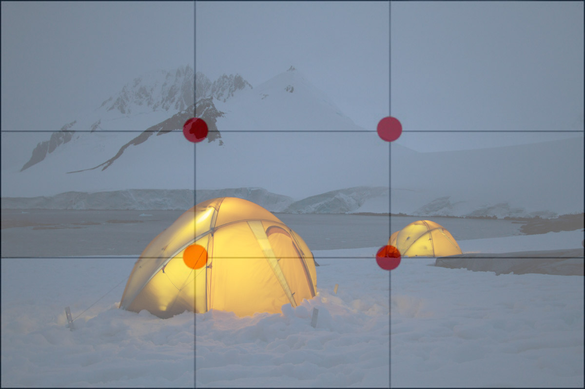
As soon as you apply the rule of thirds to this photo, the geometry becomes clear. The primary tent in the foreground is centered near the bottom left intersection of “thirds”, the mountain in the distance is centered on the upper left intersection, and the tent in the background is near the bottom right intersection. Furthermore, the right column contains all of the background elements (the other tent, some snow, a less important part of the mountain range, etc.), whereas the left two columns contain the important foreground elements. The important thing is that the photographer is using the lines and intersections to organize the composition of the photo.
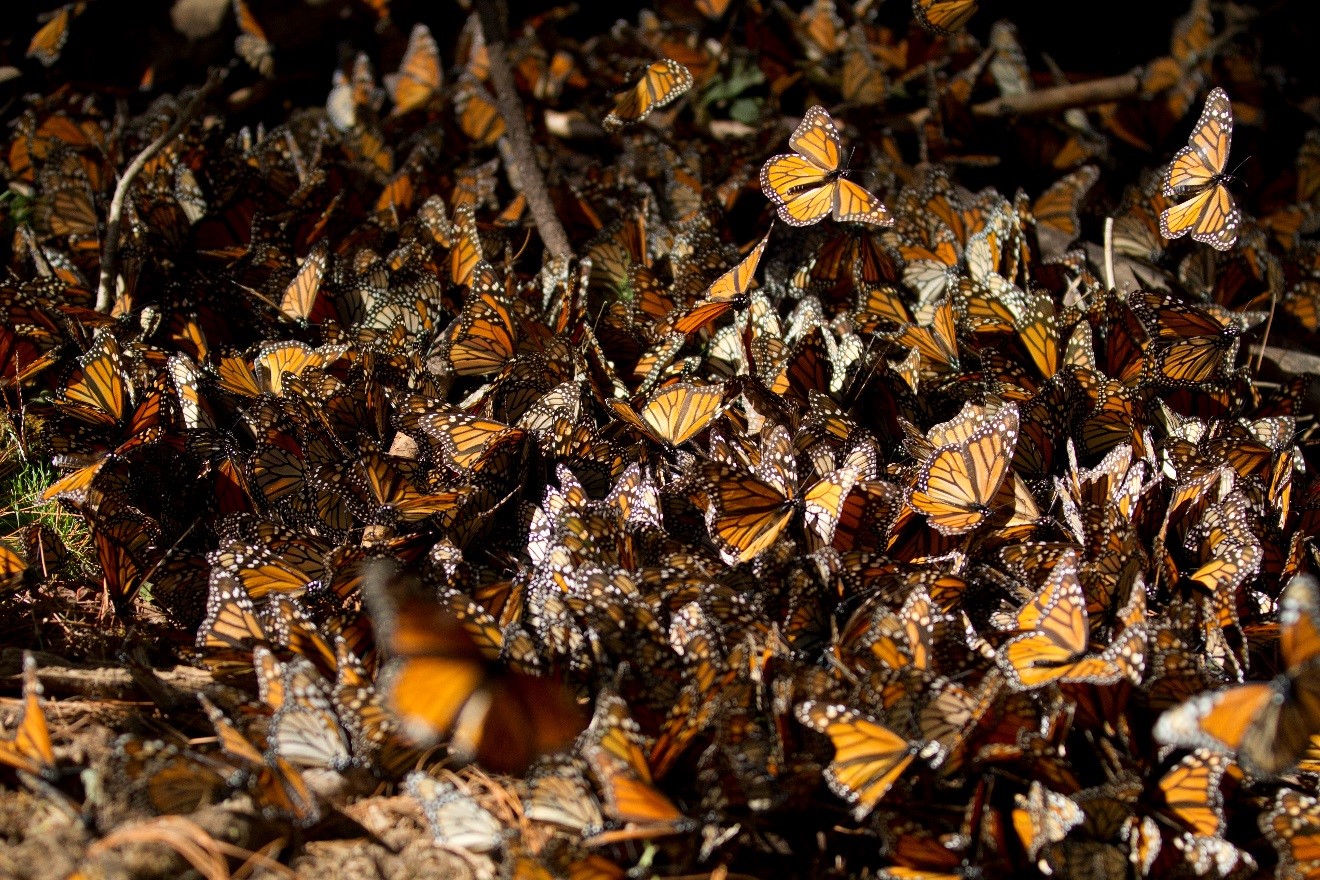
Let’s try another example. Here we have a portrait-oriented photo of monarchs in their overwintering grounds in Mexico. In this photo there are two primary elements going on, monarchs puddling on the ground and monarchs flying around bushes and through the air. By getting low to the ground, it creates a very evocative scene where one feels as if they are amongst the butterflies.
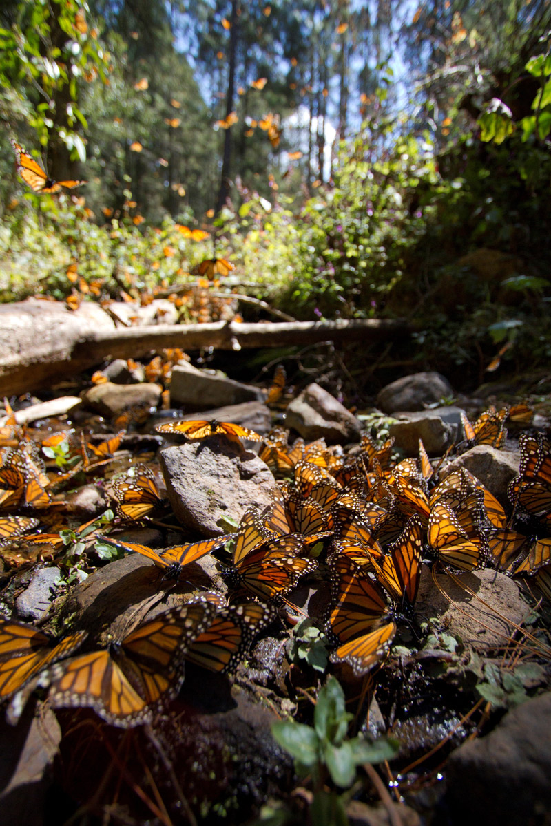
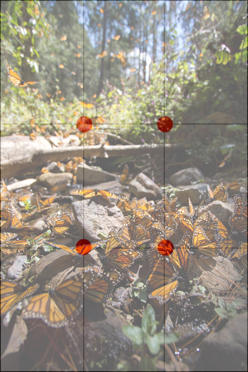
If we were to overlay the rule of thirds grid, we quickly see how the composition of the photo is aligned to the grid rather closely. The upper third of the grid is reserved for the bushes and sky, while the lower two thirds of the grid contains the monarchs on the ground. Because the human eye naturally goes to areas of the photo where “thirds” grid lines intersect, the photographer chose to center the focus on the lower two intersecting points to make those butterflies as sharp as possible.
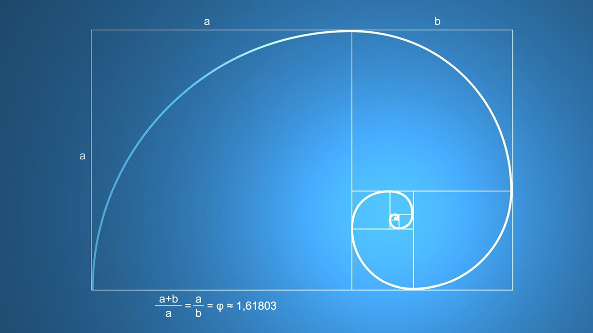
For our last example, let’s take a look at a more advanced technique to use when composing your photos. While the rule of thirds is arguably the simplest to adopt and the most flexible, another composition tool, known as “the golden ratio”, can yield impressive results. What’s more is that it helps really hammer home the idea that photo composition is grounded in real mathematics. This is certainly not the place to go into detail on the formulas and reasoning behind this “Fibonacci spiral”, so you’ll just have to trust us for the moment. Hopefully with a few examples of photographs you’ll see why this is so “naturally” pleasing to the eye.
https://www.planet-sourcecode.com/Upload_PSC/ScreenShots/PIC201521841201590.jpg
From what you’re seeing initially, you’re probably thinking that the golden ratio is really just a more precise and exacting rule of thirds. This, in fact, is exactly what it is. However, don’t let this idea stifle your creativity for, as you know, all rules are meant to be broken – right? Nevertheless, let’s take a look at a couple examples of how this spiral can yield pleasing composition.
Here we have a beautiful scene of the Ranomafana cloud forest of Madagascar. It has all the elements of a great landscape shot – vivid color, a contrast in textures (between the flowing river and dotted leaves, branches, and stones), and a balance between foreground elements (the pouring water and river rocks) and background elements (the jungle surrounding the river).
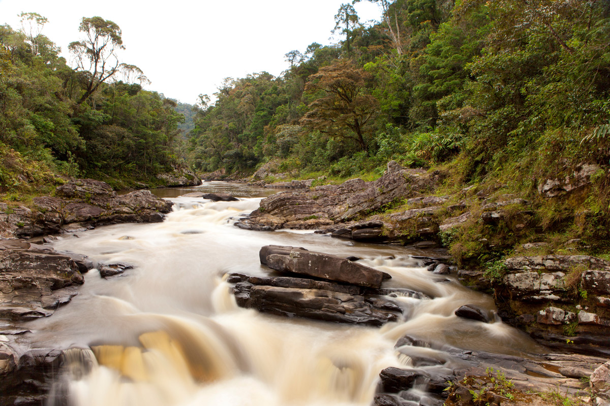
As soon as we apply the golden ratio to the top of it, we begin to make associations with the photo elements and the “nautilus shell” pattern. When we cross check this with the photo above (without the golden ratio overlay), we begin to realize how our eyes naturally follow the lines and are directed to the various key points of the ratio.
First, we see that naturally our eyes trace the outer line of the spiral and focus primarily on the photographic elements below it. That is, we tend to largely ignore the corners and far margins of the photo. Next, you’ll notice that the primary focus of the photo is actually rather near where the spiral centers (ie, the bottom left of the photo). Now, of course we could choose to flip the spiral such that it converges on the opposite side of the photo, the bottom right. This simply goes to show that the golden ratio is indeed flexible, just as the rule of thirds can be. In other words, there is nothing specifically perfect about the bottom left of the photo vs. the bottom right. It all just depends on what you’re photographing and what you find to be the most visually appealing.
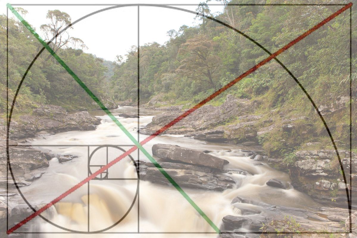
The basic idea with the golden ratio is that when each square, convergence point, and line ultimately can be associated with a prominent feature of the photo, a sense of geometry creates a more visually appealing image. At the end of the day, you should take your own “creative license” and find associations between features in your photo and features in the golden ratio.
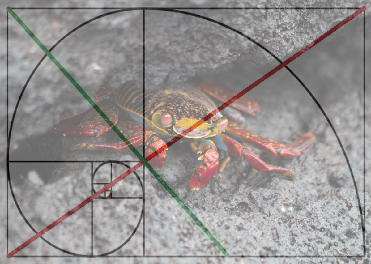
In order to demonstrate that this ratio also works well with wildlife shots, take a look at the below example. Here we have a beautiful image of a sally lightfoot crab in the Galapagos Islands. It exhibits a wonderful contrast in both colors and textures, and is in great focus. And, the composition draws the viewer in to really captivate the audience.

As you’ll see, the below overlay shows that there is again some reasoning behind the composition of the photo. First, the outer curve of the spiral perfectly encapsulates the key parts of the image, drawing the eyes just where the photographer wants you to look. However, the center of the spiral doesn’t seem to be close to the main part of the image. It’s actually right on a blurry piece of lava – what gives!? Furthermore, it’s difficult to associate key parts of the image with the squares, lines, and other parts of the golden ratio.
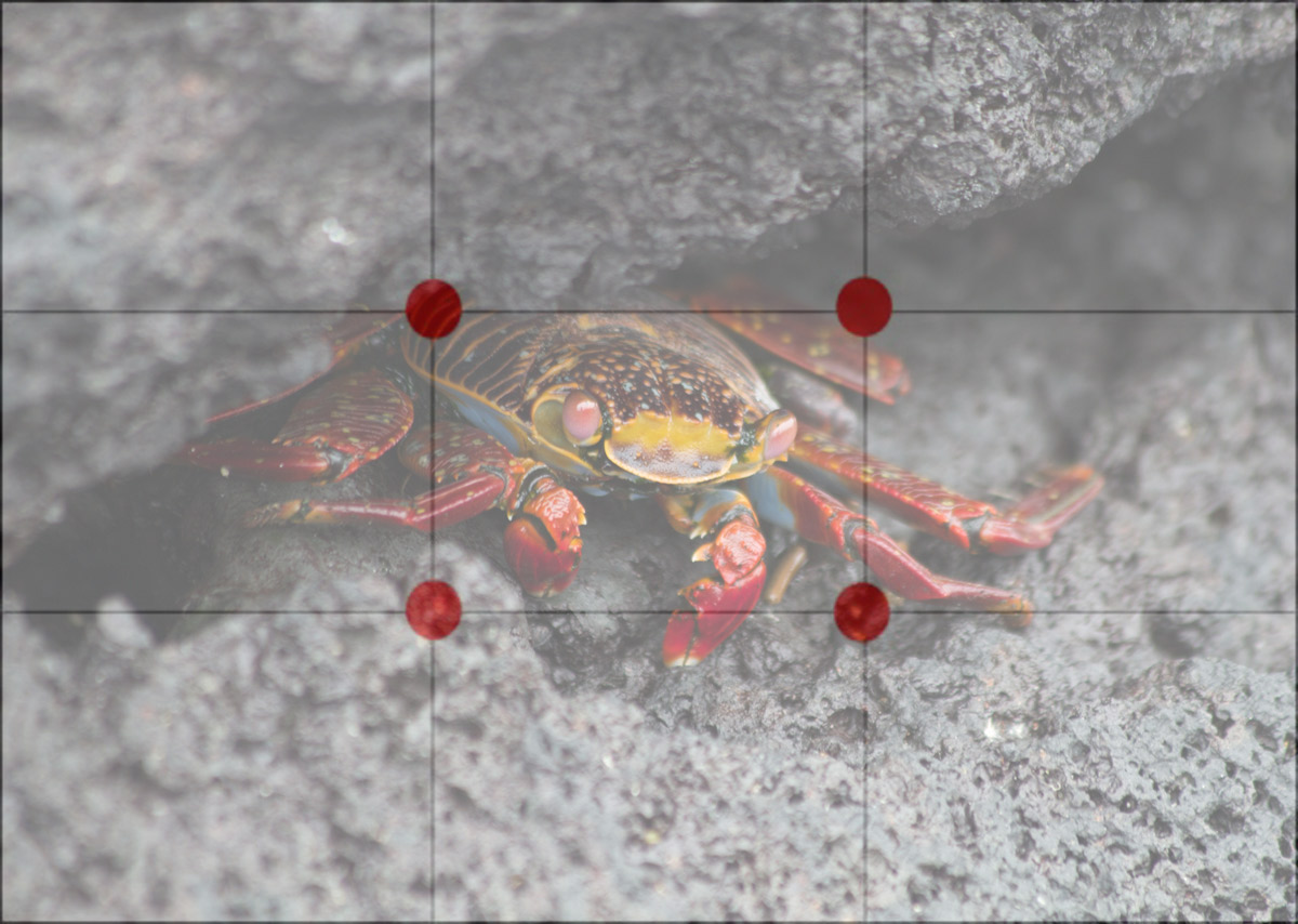
This one is a bit of a trick question, as there are parts that fit rather well, but in fact this photo was composed more on the rule of thirds dynamic rather than the golden ratio. Does that make it wrong?
Now, all of the sudden, as we look at the photo from a rule of thirds perspective, things seem to be perfect. The subject is right in the middle third, with all four of the intersecting points “squaring” the crab, and the upper and lower thirds left open for the brilliant lava texture.
Rules are always meant to be broken. However, there are tricks and tips that one should always consider, so that when you do at least break the rules, you know how and why you’re doing so.
Ultimately, desigining and composing a better photo is to make you, the one taking the photo happier. Through these simple techniques in composition, you will no doubt be more pleased with your own photography and most likely those you are showing your photos to will become even greater fans of the stories your photos tell.
